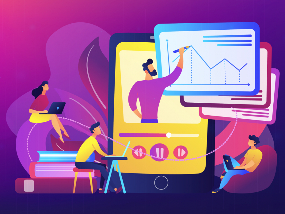
Disabled students have long campaigned for accessible online learning. Progress was slow, and there was significant resistance. Things changed when national lockdowns in many countries forced all learning online in a matter of weeks.
Old myths and excuses had to be swept aside to enable the student cohort to complete the academic year in 2020 and while the context may not have been ideal, it represented a significant positive step forward.
The plan for many institutions to provide a blended-learning approach in the new term, incorporating face-to-face and online options, is a fantastic opportunity to now embed these new ways of working for the future, providing a richer experience for everyone and a learning environment in which people can choose the method of learning that best fits their needs or preference, and enabling them to gain the most from their academic experience.
Providing learning online, however, does not automatically mean that it will be accessible to everyone. If the platforms are not built to Web Content Accessibility Guidelines (WCAG), this can mean that assistive technology users are unable to interact with the courses. If modules are not designed with accessibility and disabled users’ needs in mind, many students may be inadvertently excluded all over again.
Accessibility is about people
To help you think about what is going to be important to your users, it is useful to use personas when designing activities or tasks or creating content. Personas connect with a person’s lived experience of barriers rather than focusing on a condition itself. AbilityNet, where I’m a service delivery director, has produced persona examples for our online training course for higher and further education. Here is an example:
Adi – screenreader user and studying a business degree
-
Gets lost during online sessions when the lecturer says ‘as you can see here’ rather than describing what is on the screen.
-
Gets tired and finds it hard to focus after 20 minutes.
-
Finds it frustrating and time consuming navigating documents with messed up reading orders to get the gist of a doc, when provided with video content with no audio description, data not in proper tables, no description for graphs.
-
Struggles with PDF documents, tables and graphs in PowerPoint.
-
Likes to prepare in advance by reviewing slides to get a sense of what will be covered in the lecture but does not always have enough time to do this.
Beyond technical accessibility, there are equally vital cultural considerations. The cultural element is crucial in HE and FE due to the number of contributors creating digital content and developing or procuring digital platforms.
If the focus is purely on technical fixes without communicating the “why”, then accessibility is unlikely to be achieved in a consistent and lasting way.
Providing mandatory digital accessibility training for all staff is important in fostering collective responsibility for getting it right. Having clear messaging from senior leaders about why this is important is key, as is having them demonstrate best practice in their own content and actions. Incorporating student voice and experience will also help you achieve your objectives in this area. You can use the free McNaught Consultancy and AbilityNet Accessibility Maturity Model to evaluate institutional strengths and weaknesses and build an accessibility roadmap.
Tips for inclusive design
Inclusive online learning principles embrace the social model of disability where the focus is on removing barriers to participation at source rather than providing individual adjustments triggered by case-by-case disclosure of a disability. This is a better approach generally but invaluable in an online environment where issues may not be so immediately apparent.
A number of considerations help ensure online sessions are inclusive by design:
1) Check for accessibility
Check that the platform you are using is technically accessible to WCAG standards. Make sure your content works for assistive technology/keyboard-only users using accessibility checkers and guidance such as WCAG easy checks. Some of the most common issues relate to poor keyboard accessibility, no alternative text to describe images, use of colour alone to convey meaning, missing or incoherent structure and a lack of captions or transcripts for videos.
2) Provide information in advance
For live sessions, supply slides in advance so that people can prepare. Share a clear agenda of what will be covered and the learning outcomes, and include a housekeeping section where you explain how to activate captions if needed and when the attendees will be able to have a break. Create an Accessibility Statement for each course outlining any known accessibility issues and signposting alternatives and an easy way to report challenges
3) Give options
Offer a choice of ways to consume learning to suit all preferences and needs (for example, reading, video, practical tasks). Provide options for assessment so that all can perform at their best.
4) Be clear and concise
Make sure that the learning objectives are clearly outlined and instructions are clear and concise; keep focused on the agenda you set and don’t go off on a tangent.
5) Ask, don’t assume
When providing learning experiences online, it can be more difficult to establish whether they are meeting the needs of the students. Conversely, in this context students will sometimes feel less able to raise concerns. Provide ways of asking anonymous questions and include polls or other feedback mechanisms to gauge understanding. Create opportunities for inclusive collaboration in learning such as peer-to-peer forums.
6) Don’t be afraid to innovate
Accessibility should not stifle creativity. Provided disabled students and staff are engaged with it, and their feedback on novel approaches to learning has been obtained, this will only make the online learning experience richer.


comment